marian bantjes
item: now, archival pigment print
designer: marian bantjes
courtesy of: 20 X 200 a jen beckman project
comments: marian bantjes is a graphic designer, typographer, writer and illustrator from canada. her work reflects detailed and complex patterns. this piece, titled now, is part of 20 X 200. this is a project that offers limited edition art at low prices online in an effort to get emerging artists' work out to the masses. their motto is "everyone needs art" and this is their way of making that happen. brilliant.
swatch table, hella jongerius
item: swatch table
designer: hella jongerius, berlin
materials: walnut and multi-colored resin blocks
courtesy of: jongeriuslab
photos via: jongeriuslab and wallpaper magazine
comments:
splay leg table, george nakashima
item: splay leg table, 1948
designer: george nakashima
materials: hickory top american walnut legs, apron and edge detail
courtesy of: wallpaper magazine
photo via: furnish.co.uk and galere
comments: george nakashima was trained as an architect before he began to design and build furniture. his work is beautiful in its simplicity and respect for materials. he was able to bring beauty out of wood that others might have discarded but that he felt was worth the challenge. some of his pieces had butterfly joints, visible splits in the wood and left the rough edges of the wood to show the beauty of the imperfections in the wood, as shown in the second photo. he felt that the hardships the tree may have suffered (time, wind and weather) only added to the beauty. profoundly beautiful.
hermes
event: hermes festival of crafts
location: hermes store, chicago
comments: where to begin this story. a friend of mine called me last week and in a very excited, out of breath kind of way, she proceeded to tell me about this amazing experience she had at the hermes store. i've never been inside an hermes store, nor have i honestly thought about making a purchase there. it's something that has always been outside of my frugal world. anyway, she went on to tell me about this event they were hosting where they had their craftsmen from france come to the store to demonstrate their art and to explain their process and the materials they use. well, she had me hooked. with every detail she relayed to me, i got more and more intrigued. she was right, the event was amazing and inspirational. each artisan i spoke with told the story of their craft while they were actually making an item in the store. they talked of where they learned it, how long they have been honing their craft (none less than 10 years) how it is done, how the materials are found etc. each part of their story also told of the incredibly high standards that they adhere to and the patience in their work. most of what they sell is hand made. along the way if any part of the process is below standards, the item is then destroyed. it does not get sold by hermes unless it meets all quality standards. they make their products to last and they will not accept anything that will compromise that. the images above are mostly of their scarves. the blue image is of a screen for printing a scarf. the last image is of fabric printed with materials to make 2 ties. it's incredible the work they put into the artwork. the colors are hand separated onto acetate so that each color can be made into a screen for printing. this process can take 12 months to complete depending on the complexity of the artwork. the scarves are made up of multiple colors. the maximum is 45 colors to give you an idea of the complexity. the ties are sewn by hand with single thread and no knots. no knots at all. i can't explain what a thrill it was to watch the artisan sew a tie by hand. her stitches were exquisite. the woman who hand stitches the men's shirts was also working with single thread, no knots and mostly concealed stitches. breathtaking detail. we also witnessed the artisan who makes their purses. again, hand stitched. there was also a watch maker, saddle maker and a jeweler. i left their having an incredible appreciation for what they make and a desire to save up the money to buy something from them in the future. their passion, incredibly high quality standards, exquisite materials and love of craft made an impression on me that won't go away any time soon.
elding oscarson
project: the townhouse
designed by: jonas elding of elding oscarson
location: landskrona, sweden
courtesy of: dwell magazine
photos via: elding oscarson
comments: this modern townhouse sits in stark contrast to its neighbors in this rural town in southern sweden. despite the contrast, it seems to fit in well with respect to its proportions and its openness. the design is beautiful in how it uses the space on each of the three floors. light reaches every level because of the expansive windows and because none of the levels is completely closed off from the others. this also allows for double and single height ceilings which gives an open feel to the space. even the walkway from the bathroom to the roof terrace is made of metal grille which lets in light and adds to this open feeling. all of this is even more amazing knowing that the structure is only 16 feet wide yet has such an open, expansive feeling. amazing indeed.
pray for japan
designer: print designed by adamgf, a graphic designer born in dublin who now lives in the uk.
courtesy of: spoon & tamago blog
comments: it's impossible to process the profound loss and sadness that is happening in japan right now. people from all over the world are doing what they can to help to ease the pain and suffering. adamgf has designed a print to communicate a call for compassion and to help contribute to the recovery efforts. proceeds from purchases of the print will go directly to the japanese red cross. check out this link for more information on how to make a purchase.
sugamo shinkin bank
item: sugamo shinkin bank, tokyo
designed by: emmanuelle moureaux architecture and design
photos via: dezeen
comments: the exterior of the building is perforated with images of trees and its many windows are enveloped in bright colors. the tree motif is extended into the interior of the building which has images of trees and leaves throughout as well as live trees. the thought process for the design was based on making a happy, natural, refreshing and welcoming space for their customers and employees. The more than 24 colors used in the interior and exterior convey that happy feeling very well. exquisite.
alvisilk chair

item: alvisilk chair
designer: asa karner of alvi design, sweden
materials: fsc oak and silk thread
photos via: inhabitat
comments: asa karner founded alvi design in 2007. here is how she describes her work and the goals she is trying to achieve.
“My ambition is to design furniture and products, using environmentally friendly materials with a focus on sustainable production methods and humane working conditions. These are the criteria I use as a platform for my design and production.” "During my education I put a lot of effort in broadening my knowledge in ecological and sustainable design and production. In my design, my am is to, in a playful way, to combine and push the limits between modern, functional design, art and handicraft from different cultures.”
the inspiration for the design of this chair comes from wooden looms, reflecting the rich history of craft in her native sweden. the line of the chair exudes weightlessness while the pattern of the thread creates complex and beautiful shadows. amazing.
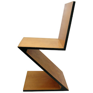
gerrit rietveld
designer: gerrit rietveld
material: zig zag chair, cherry and steltman chair, oak
photos via: rietveld-moebel and architonic
comments: gerrit rietveld (1888-1964), was a dutch architect and designer and a member of the de stijl movement. the movement reflected harmony and order that came from abstraction and reduction of form and color. compositions contained straight horizontal and vertical elements, strong asymmetry and the link between the positive and negative space of the non objective forms. these two chairs embody the movement well. the zig zag chair, designed in 1934, contains four pieces joined with dovetail construction. the steltman chair, designed in 1963, is a wonder of asymmetrical design. both chairs are timeless, classic gems.
bio-luminum
item: bio-luminum tiles
distributed by: coverings etc
material: 100% recycled aircraft aluminum
photos via: top: coverings etc middle: inhabitat and bottom: green launches
comments: these aluminum tiles come from reclaimed aircraft parts. when planes are retired, they go to remote sights called airplane graveyards or bone yards around the country where they sit useless. not anymore. coverings etc, has found a way to re-purpose the aluminum into blocks which can then be made into these tiles. the tiles are very durable which make them a good choice for high traffic floor areas as well as for wall treatments. not only are they 100% recycled, but they are 100% recyclable. the energy used in the recycling process is 5% of what is used in first generation aluminum production. coverings etc is also starting a buy back program so that when customers are finished with the tiles, they can sell them back at raw material cost. it's admirable that coverings etc pushed so hard to find a use for this vast amount of waste material from retired aircraft. it took time, research and design thinking on their part to figure out how the material could be recycled and how it could be made into a beautiful, viable product. thoughtful design at it's best.
jupiter scrap lights
item: jupiter scrap lights
designed by: graypants design, seattle
materials: discarded corrugate
photos via: top photo: graypants and bottom photo: designcrave
comments: this must be love. wow. the fact that these lights are made from corrugate, have great shape and proportions and create such beautiful light is enough to put a skip in my step. i admire when designers use materials that are often overlooked or taken for granted and take them completely out of context to show their inherent beauty. the fact that it's also making something functional out of materials that would otherwise be discarded or recycled just makes it that much more lovely. graypants is a design studio in seattle started by two friends, seth and john, who met in school while studying architecture and design. here is a paragraph from their website that succinctly and eloquently describes who they are and what they do.
"we strive to come up with designs and ideas that are thoughtful and have an impact, whether it be furniture, lighting, architecture or graphics. each one of our projects has a unique story and we try to explore new ideas to redefine how design can have a greater impact. most importantly, we have fun doing it! we enjoy collaborating with all walks of life – that is where we find true inspiration. we want to let the beauty of what we love be what we do." well done graypants!
Subscribe to:
Comments (Atom)


