Showing posts with label architecture. Show all posts
andersson-wise
item: stone creek camp
architects: andersson-wise, austin tx
photos via: andersson-wise
comments: stone creek camp is a series of buildings that andersson-wise built for a client in montana. there is a gatehouse, lodge, guesthouse and the main house which is featured in the images above. some of the walls are made of douglas fir, larch and grand fir trees that were removed from the site. they are cut to size and stacked on both sides of an insulated water-proof material. there are also some rock walls that are made of local granite. the roof is fully planted. all of these design decisions lend this building an organic feel that is just stunning.
sanaa
item: new museum of contemporary art, ny
architects: kazuyo sejima + ryue nishizawa of sanaa
photos via: arcspace
comments: recently i had the pleasure of attending a lecture at the art institute of chicago featuring kazuyo sejima + ryue nishizawa, the 2010 pritzker prize winners, of the architectural firm sanaa. they talked about ten of their projects, most of them completed with just a few that are still in progress. what struck me about their work is their focus on the relationship and tension between the interior of the buildings and the natural environment of the exterior, the idea of flow within a space, and the attributes of light and reflection. they use materials like glass, plexiglass and aluminum to achieve those qualities. the work i chose to feature in this post is the new museum of contemporary art in ny. the architects arrived at the stacked boxes based on the museum's need for specific galleries. they decided to stack them off center to allow natural light and unique views of the city. the boxes at the top of the building have a smaller footprint so they increased the ceiling height to keep the feeling of openness. the building does not have columns so that maximum flexibility to reconfigure the space based on the specific shows is maintained. galvanized, zinc-plated steel clads the exterior of the building which at night is illuminated from the interior lighting. check out arcspace for more information about their work. incredible.
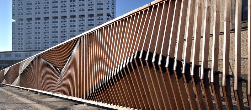
fence erasmus mc
item: construction fence for rotterdam erasmus medical center
materials: spruce and steel
designed by: origins architects, rotterdam
photos via: origins architects
comments: when the erasmus medical center renovation project began, ideas were submitted for the design of the construction fence. the reasons for that are two fold. one, the renovation plan was quite extensive, requiring the fence to be up for possibly ten or more years. and two, the netherlands has a practice of spending 1 percent of the budget on projects of this scale for public artwork. the fence by origins is an amazing piece of art. it's made of simple materials, spruce and steel. the design consists of two modules that are reconfigured to create a beautiful meandering shape. the texture and rhythm of the lines is a stunning solution to the challenge of making a construction fence that protects the public from the renovation while also providing something rich and engaging that enhances the environment visually. fascinating.
petting zoo, 70f architects
item: petting zoo, almere netherlands
architect: 70f
photos via: 70f
comments: 70f, a design firm in the netherlands that practices architecture, interior design and product design, was commissioned to redesign a petting zoo in almere that had burned down. the budget was small (mostly donations) so they kept the existing foundation and decided to create a simple design. half of the structure contains a stable and the other half has washrooms, and storage and on the second floor offices. the stable section is only one floor with double the height. the upper portion of the structure is slatted to allow the maximum amount of ventilation. very important when housing animals. a unique aspect of this design is that there aren't any doors. there are a series of folding shutters, some for animals, some for the public. these shutters don't have frames so when closed, they blend seamlessly with the building. the shutters can be opened manually, but also open automatically when the sun rises and close when it sets. the firm describes it as the building waking up in the morning and going to sleep at night. nice. during the construction of the building the lights were left on accidentally sometimes by the construction crew. neighboring residents asked that the lights be left on as the slatted facade of the building became a beacon or lantern for the surrounding park. wow, love this!

airspace tokyo, thom faulders
item: airspace tokyo, screen facade design
architect: thom faulders
photos via: faulders studio
comments: the building was adapted into a residence/photo studio. due to the construction work, a large amount of greenery was removed. this project called for a cover or wrap of the building with similar characteristics of the greenery to provide the same functions it had provided. faulders designed the facade to do just that. light is deflected by the multi layer facade. rainwater is directed away from walkways via capillary action. privacy is maintained because interior views are obstructed by the complex layers of the design. it's interesting that visually it is stunning and draws a lot of attention while also maintaining privacy.
container guest house, poteet architects
item: container guest house
designer: poteet architects, texas
photos via: poteet architects
comments: container guest house is small in size but big on beauty, efficiency and reuse of materials. the planted roof off the container top allows for air flow and reduces heat gain. grey water from the sink and shower are collected and used for the planted roof. the toilet is composting. recycled telephone poles are the foundation that the structure floats on. hvac pads made from recycled bottles in a steel frame are used as a deck. exterior light fixtures come from tractor disc plow blades. the interior is insulated with spray foam and lined with bamboo plywood for the floor and walls. i love this too, too much.
elding oscarson
project: the townhouse
designed by: jonas elding of elding oscarson
location: landskrona, sweden
courtesy of: dwell magazine
photos via: elding oscarson
comments: this modern townhouse sits in stark contrast to its neighbors in this rural town in southern sweden. despite the contrast, it seems to fit in well with respect to its proportions and its openness. the design is beautiful in how it uses the space on each of the three floors. light reaches every level because of the expansive windows and because none of the levels is completely closed off from the others. this also allows for double and single height ceilings which gives an open feel to the space. even the walkway from the bathroom to the roof terrace is made of metal grille which lets in light and adds to this open feeling. all of this is even more amazing knowing that the structure is only 16 feet wide yet has such an open, expansive feeling. amazing indeed.
sugamo shinkin bank
item: sugamo shinkin bank, tokyo
designed by: emmanuelle moureaux architecture and design
photos via: dezeen
comments: the exterior of the building is perforated with images of trees and its many windows are enveloped in bright colors. the tree motif is extended into the interior of the building which has images of trees and leaves throughout as well as live trees. the thought process for the design was based on making a happy, natural, refreshing and welcoming space for their customers and employees. The more than 24 colors used in the interior and exterior convey that happy feeling very well. exquisite.
Subscribe to:
Posts (Atom)