shanghai houtan park
item: shanghai houtan park
designed by: turenscape
photos via: turenscape
comments: this site originally was industrial and mostly used as landfill. the design, with its reuse of materials, agriculture and wetlands is treating the polluted water and creating a beautiful and useful public space. all of the design elements are stunning, but i am particularly drawn to the first few images of the metal canopies. wow.
naoto fukasawa
items: designs from "re-design--daily products of the 21st century" exhibit
designer: naoto fukasawa
photos via: hara design institute
comments: the designer, kenya hara, curated the exhibit which showcased the re-design of everyday items. one of the items in the exhibit was designed by naoto fukasawa. naoto re-designed the humble teabag. he explains his design shown in the first two photos as "centre of awareness", part of which is knowing when the tea is ready by the color it creates. the ring that he attached to the end of the string is the color of the tea when it is ready. this is a subtle guide for the end user to measure, if they want to, when the tea is ready. it also works as part of the packaging to contain the materials. lastly, he quips that maybe it's not important to know that you can measure the color by the ring, but instead it might be more important to remove the ring and give it to the person you are sharing tea with. oh i love that idea! the next image shows the re-design based on the movement that is needed to make the tea. he observed that this movement was similar to that of a marionette. the piece at the end of the string allows for movement similar to that of a marionette. also, he changed the teabag shape to that of a doll which when placed in hot water swelled to give a more jovial shape. love the whimsy and playfulness that he imparted to this design. the last image shows a design that is based on observing that a used teabag creates a beautiful brown color. he decided to use the tea to dye the packaging. this way, the end user gets a hint at the color and the wonderful fragrance of the tea in the packaging. he also used that same color but a bit darker to print the name of the tea on the packaging. thoughtful, simple and beautiful. naoto is one of my favorite designers because those three words describe everything he does.
paintsquare
designers: paintsquare
photos via: etsy
comments: paintsquare is a designer/architect team who use scrap wood to make these beautiful pieces of art. their work is available for sale on etsy. nice.
nicola stäubli
item: crutch
designer: nicola stäubli
photos via: nicola stäubli
comments: crutch, by nicola stäubli is actually bent steel table legs and lashing straps. the end user provides the table top. the table top corners are aligned with the legs and the straps create the tension to hold everything together. the benefits are that you can use the table top size and material that suits your needs, and, because of the construction, your table will easily be broken down and portable. love the fact that this design is beautiful, simple and utilitarian. wow.
darin montgomery and trey jones
item: sidebar
designers: darin montgomery and trey jones
materials: solid walnut, walnut plywood and corian
photos via: urbancase and find.eat.drink.
comments: this cabinet was designed by darin montgomery and trey jones of urbancase in seattle. they collaborated with teroforma who designed the glassware to go inside the cabinet. the cabinet is made with walnut and the inside has a diamond pattern incised that resembles diamond tuck and roll upholstery. the top is white corian. there is a white version that has the pattern on the exterior which is corian while the interior is solid walnut. there is something about the lines and proportion of this piece. knowing the details of the pattern and the glassware with it's similar design makes it even more special.
remed
artist: remed
photos via: unurth.com
comments: these murals are made by french graffiti artist, remed. his color choices, illustration style and compositions are arresting. would love to see one someday.
wim crouwel
designer: wim crouwel
photos via: monoscope and designspiration
comments: wim crouwel is a dutch graphic designer who started out as a painter. what's interesting about that is his paintings were expressionist, yet his graphic design is heavily influenced by the bauhaus movement. swiss typography, with it's use of grids and sans serif type lend his work precision and a modern aesthetic. just beautiful. if you haven't seen the documentary helvetica yet, you should check it out because it's riveting, but also because wim is in it and you can hear him talk about graphic design in his own words.
zip tie light kit
item: zip tie light kit
designer: steven haulenbeek, chicago
photos via: inhabitat
comments: this light fixture is sold not as the final product but as instructions only. the end user buys the zip ties, fluorescent tube and cord, follows the instructions and creates the light fixture themselves. steven had previously worked at a high end furniture/lighting store where he sold beautiful and expensive pieces. his intent with this project was to design something beautiful but inexpensive. his decision was then to sell the instructions only and to design it with inexpensive, utilitarian materials. the end result is a beautiful piece that the end user has the satisfaction of making themselves. i love this!
alex kopps, artwork
items: mixed media artwork
artist: alex kopps
images via: alex kopps
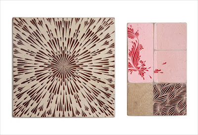
comments: alex is an artist from san francisco. these mixed media pieces are latex, gouache, spraypaint (select pieces) and graphite on wood. while abstract, they hint at nature as the inspiration. i found it hard to pass them up so i hope you enjoy them too.
yellow diva
item: fandeck
designed by: yellow diva, melbourne
materials: natural or black stained birch
photos via: yellow diva
comments: this pendant lamp shade comes flat packed. you place the petals over an existing cord and space them out by hand to create the shade. minimal packaging, simple to assemble, beautiful when switched off and amazing texture when lit. love this.
tim fleming, flatware
item: flatware
designer: tim fleming
photos via: the design files and indesignlive
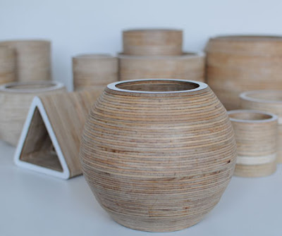
comments: tim uses blocks of plywood and hollows them out to create a line of vessels called, flatware. he also uses the piece of the block that he hollowed out to make additional vessels. they are beautiful and elegant and i just couldn't resist posting about them.
Subscribe to:
Comments (Atom)


