shanghay chair, kibisi
item: shanghay chair
designed by: kibisi, denmark
material: molded plywood
courtesy of: kibisi
comments: kibisi is a design firm in denmark with experience in architecture and industrial design. the shanghay chair is made up of only 4 pieces that make up the seat, legs and back. it is available in many colors and is simple to assemble. this allows people to reassemble them into multi color combinations of their choice. So much fun.
mia cullin
items: four leaf clover carpet and flower curtain/room divider
designer: mia cullin, sweden
materials: four leaf clover: leather and flower: tyvek
courtesy of: mia cullin
comments: mia is a designer and interior architect in sweden. the textile work shown above shows her interests in geometry, hand crafts and origami. the pieces are modular and when joined together, create slightly raised surfaces with geometric patterns. her work is inspiring and beautiful.
molecules, ofir zucker, albi serfaty and ilan garibi
item: molecules lighting collection
designers: ofir zucker, albi serfaty in collaboration with ilan garibi
courtesy of: aqua creations
comments: molecules is a collection of lighting based on the origami art of ilan garibi. the paper is folded by hand into tessellations (2d tiling patterns using only folded paper). these lamps are powered by leds and operated by touch. natural materials, art and technology combine in a powerful way.
hexagon, form us with love
item: hexagon
designer: form us with love, sweden
materials: wood, water and cement
photos via: form us with love
comments: form us with love is a design studio in sweden. they created hexagon as a way to reduce the echo in their studio. it is a beautiful product with an amazing list of functionality. hexagon is recyclable, regulates moisture, it discourages mold, will not rot, absorbs and emits heat to help regulate temperature, and lastly it absorbs sound to reduce noise. it can be applied to walls magnetically (tiles can be rearranged infinitely) or with glue/nails. wow, it's visual interest (texture, color, flexibility and shape) are wonderful, but to know the additional positive attributes make hexagon exponentially better. well done!
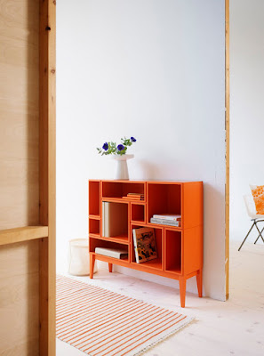
citti, by zweed
item: citti
designer: zweed, sweden
photos via: cool hunting
comments: citti is a storage system that is modular. the customer chooses the size, depth, number of modules (with or without doors) and color. it is made by local craftsmen but costs are kept down by the small scale of the modular units. love that the customer can create their own unique combination. sweet.
chip kidd
designer: chip kidd
images via: ny times blog, design history and vol.1 brooklyn
comments: a few weeks ago, i was lucky enough to hear chip kidd speak at columbia college in chicago. his work as a graphic designer is compelling. he has been incredibly prolific in the number and quality of book cover designs he has created for knopf. hearing the thought process behind his work was riveting. all of that would have been plenty but he is also such a funny, funny guy. my side hurt for days after that lecture. love it when that happens.
plaid bench by raw edges
item: plaid bench
designer: raw edges, uk
materials: hardwood, plywood and pine
photos via: designboom
comments: raw edges, a design firm in the uk with designers yael mer and shay akalay, designed plaid bench as part of the bench 10 project for london design week 2010. the seating unit consists of three different benches which can be used separately or they can be interlocked to form a large seat with a stunning plaid pattern. yum.
container guest house, poteet architects
item: container guest house
designer: poteet architects, texas
photos via: poteet architects
comments: container guest house is small in size but big on beauty, efficiency and reuse of materials. the planted roof off the container top allows for air flow and reduces heat gain. grey water from the sink and shower are collected and used for the planted roof. the toilet is composting. recycled telephone poles are the foundation that the structure floats on. hvac pads made from recycled bottles in a steel frame are used as a deck. exterior light fixtures come from tractor disc plow blades. the interior is insulated with spray foam and lined with bamboo plywood for the floor and walls. i love this too, too much.
seasons by nao tamura
item: seasons
designer: nao tamura
material: silicone
photos via: spoon & tamago
courtesy of: nao tamura
comments: nao talks on her website about how japan uses nature as a functional and decorative part of food preparation and service. cherry leaves are used to wrap sweets, tomatoes are carved out and used as containers and fallen leaves decorate the table. seasons was inspired by nature and technology through the vision of japanese culture. seasons are flexible like real leaves so they can be used flat or rolled to serve foods. they can also used as sculptural decor. the silicone material allows them to be used in the oven, microwave and dishwasher. eloquent and simple solution well executed. bravo.
folding a part, mika barr
item: folding a part
material: hand dyed fabric silk screened with geometric patterns
designer: mika barr, israel
photos via: mika barr and designboom
comments: mika created these fabrics because of her interest in geometric patterns in nature. she dyed and silk screen printed the fabrics with these patterns to inform the way the fabric drapes and folds. areas that are silk screened are inflexible which allows the non printed areas to fold, thus creating shape. the three dimensional quality of these fabrics is stunning. the origami geek in me is quite intrigued.
post letters
item: post letters letterpress print
designers: createtwo studio, joseph velasquez, the baltimore print studio, and matt griffin.
image via: post letters
comments: bethany heck and david wolske have teamed up for a collaborative letterpress project, called post letters. the first participant prints a small run of one-color prints. the prints are then passed along to four more participants who over print their work. after all five have completed their printing the prints will be available for sale at felt & wire.
michelle thompson
items: illustrations
artist: michelle thompson, uk
materials: combination of traditional collage techniques and digital technology.
images via: michelle thompson
comments: michelle's work combines mark making, collage, photography and digital processes. she works with found, created, figurative, abstract and typographic elements. use the link above to check out more of her work and background on her website. poetic work.
pod 1 tray with bamboo insert
item: pod 1 tray with bamboo insert
designed by: ftf design studio, new york
materials: corian and bamboo
photo via: ftf design studio
comments: ftf design studio is the furniture and accessory collection of interior designer roseann repetti and her husband, architect west chin. this tray could take all my worries away. nice.
tikoli tea towels
item: tea towels
materials: 100% cotton
designed by: tikoli
photos via: tikoli
comments: the images say it all, these tea towels are lovely.
fractal garden
item: fractal garden
designer: legge lewis legge
materials: steel, soil, casters, ground cover plantings
photos via: legge lewis legge
comments: fractal garden is a group of 21 planters on wheels, each of which can be moved and regrouped to form an infinite number of designs. each of these 4-sided planters have been designed with angles that allow for many combinations. the math of the angles relates to fractal geometry which mimicks the structure of forms in nature. fractal garden was commissioned in 2009 for the 10th anniversary of the international garden festival, held annually at the jardins de metis, reford gardens, grand-métis, québec, canada. legge lewis legge is a public art and design studio based in new york and texas operated by architect murray legge aia and filmaker deborah e. lewis, both in austin, and artist andrea legge in new york city. check out their website to see all of their projects. amazing doesn't quite do this justice.
Subscribe to:
Comments (Atom)


