quantum table


item: quantum table
designer: jason phillips
photos via: yanko design and jason phillips
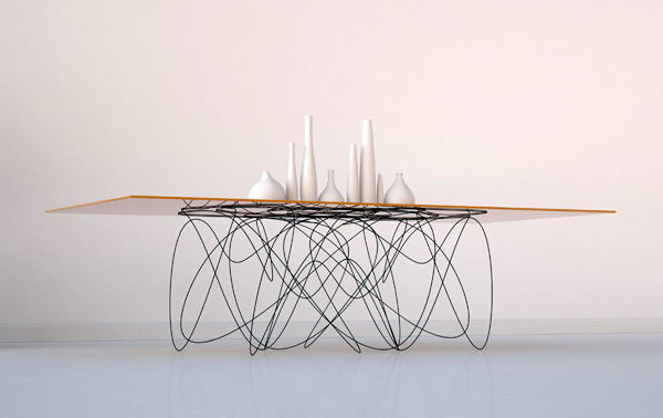
comments: the design of this table was inspired by quantum physics. yes, you read that correctly, quantum physics. interesting. the designer talks about how the transfer of energy between particles of matter informed the design. the base of the table, which is hand formed heavy gauge steel, implies the movement of the particles. love, love, love this! the lines of the base of the table are so fluid and light, which is in contrast to the strength and stability it provides to the top. pure genius.
shen-hui hsu


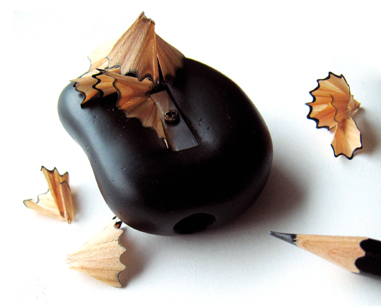
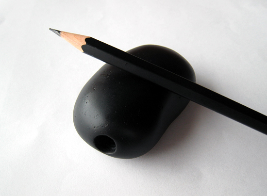
item: stone pencil sharpener
designer: shen-hui hsu
photos via: designboom
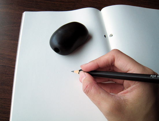
comments: shen-hui hsu is a designer from taiwan. the stone pencil sharpeners are beautiful in shape, form and volume. not only are they functional as a sharpener, they can also be used as a paper weight. i admire when designers work on everyday items that most people don't notice and make them functional and beautiful. there is something about giving thought and time to seemingly mundane items to transform them with poetic beauty while maintaining their utility that just makes me happy. enjoy!

fred eerdekens


item: could suggest something
material: copper and light source
artist: fred eerdekens
photos via: happiness is blog
comments: fred is a sculptor whose work shown here transforms when a light source is present. the lines are really beautiful and it's amazing how the abstract shapes create the lettering.

bookhou


designers: john booth and arounna khounnoraj
photos via: bookhou
comments: john is an architect and arounna is an artist. together they are the multidisciplinary design firm, bookhou. their focus is natural materials, hand made designs and small production runs. these are just a few samples of their work. please check out their website and if you are in toronto, stop by their store.

jennis li cheng tien


artist: jennis li cheng tien
Images via: lancia trend visions
comments: these pieces are from a series called have a nice day. the artist used images found online and through digital manipulation and collage techniques arrived at these etherial images. they are spectacular, hope you enjoy them too.

nada le hoang an


items: leather handbags
designer: nada le hoang an
photos via: i/object
comments: nada's designs are a nod to origami. some of her bags have folds which conceal hidden pockets and pouches. on her website it says that her challenge is to design bags without stitching where leather straps and knots replace metal fasteners. her work is fascinating and i love that she puts so much thought and unique vision into her work.

nicola starr


artist: nicola starr
photos via: nicola starr
comments: nicola spends a good amount of her time sourcing the found materials she uses in her collages. she is also an illustrator which you can see in the last image. her work is interesting because it's made with found materials that are in some cases vintage but the compositions are clean and modern. nice.

andy denzler


artist: andy denzler
photos via: darkwhite
comments: andy started out as a photographer and graphic designer before he turned to painting. his work is an interesting balance of representation and abstraction. it seems to represent the struggle or contrast between traditional techniques and technology. i'm hooked.

fanette mellier


designer: fanette mellier
photos via: pk and bastien charpy
comments: fanette is a graphic designer from france. her work is an interesting mix of typographic and color experimentation. some of the work shown here comes from her public space art where she pushes the scale and legibility of the type. legibility is only achieved from far away. up close, the pieces appear to be abstract studies in shape and color. so glad I stumbled upon her work.

ff scala


item: font family scala
designer: martin majoor
images via: martin majoor
comments: martin designed the font family scala in 1989 and later added scala sans. it's interesting that he combined serif and sans serif in the same font family. check out his website for more information about scala.

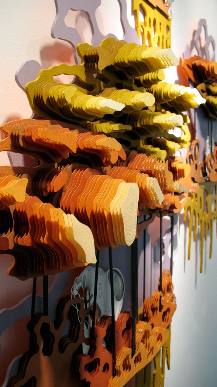
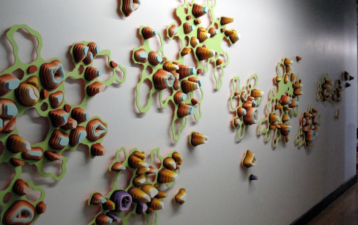
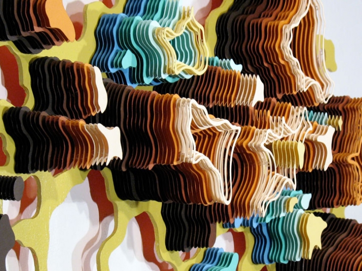
charles clary


artist: charles clary
photos via: yatzer
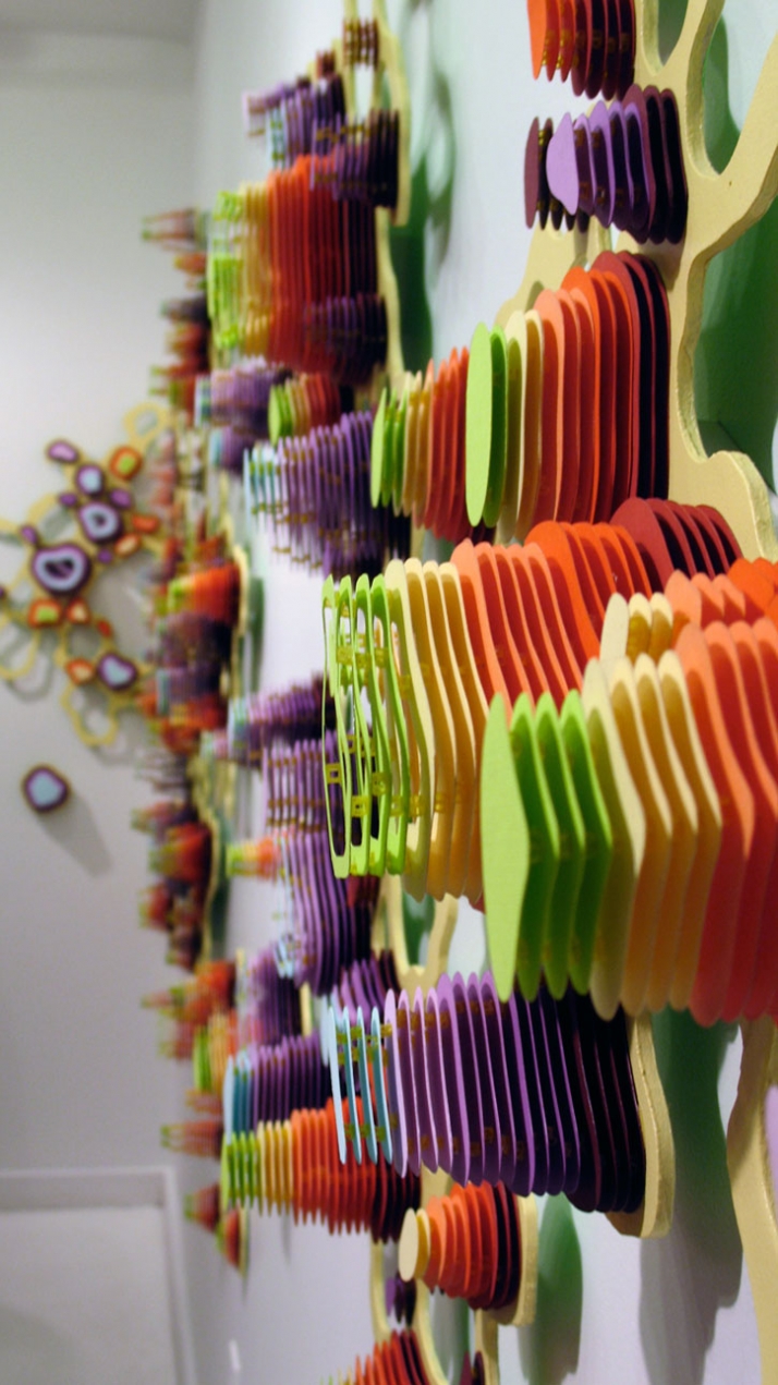
comments: charles' spectacular paper art pieces are painstakingly cut by hand. some of his works can have thousands of paper layers. after being cut, they are assembled into towers with each layer containing spacers to add to the dimensionality and then mounted to wooden panels. the towers are then grouped to make the final piece. amazing. i was lucky enough to see some of his work in a gallery in nashville a few years ago. the images are wonderful but seeing his work in person is not to be missed.
Pinterest